Unveiling the Art of Invincible Season 1
The Art Of Invincible Season 1 captivated audiences with its brutal action sequences and surprisingly nuanced characters. This exploration dives deep into the artistic choices that brought the comic book series to life on screen, focusing on the unique visual style, character design, and animation techniques employed. We’ll analyze how these elements contributed to the show’s overall impact, resonating with viewers and critics alike.
Deconstructing the Visual Language of Invincible
Invincible distinguishes itself from other superhero animations with its bold and graphic visual style. The show embraces a realistic approach to violence, portraying the consequences of superhuman battles with unflinching detail. This commitment to realism elevates the stakes and makes the fights feel visceral and impactful. However, the show balances this grit with moments of levity and humor, preventing it from becoming overly bleak. This dynamic interplay creates a compelling viewing experience that keeps you on the edge of your seat.
The color palette also plays a crucial role in setting the tone. Vibrant hues are used strategically to emphasize the superheroic nature of the world, while darker shades underscore the more dramatic and violent moments. This careful use of color enhances the emotional impact of each scene, guiding the viewer through the narrative’s highs and lows. What other techniques do you think contribute to the show’s visual appeal?
Character Design: A Blend of Classic and Contemporary
The character designs in Invincible strike a balance between classic superhero aesthetics and a more modern, grounded sensibility. While some characters retain the traditional brightly colored costumes and exaggerated proportions, others sport more realistic and contemporary attire. This diversity in design reflects the diverse cast of characters and their varying backgrounds and motivations. It allows for a broader range of visual storytelling, from the iconic imagery of Omni-Man to the more relatable appearance of Mark Grayson.
Beyond the costumes, the character expressions and body language are meticulously crafted to convey a wide range of emotions. Subtle nuances in facial expressions and posture communicate complex feelings, adding depth to the characters and making them feel more human. This attention to detail elevates the storytelling beyond the typical superhero tropes, creating characters that resonate with viewers on a personal level.
The Impact of Animation Techniques
The animation techniques used in Invincible are instrumental in bringing the dynamic action sequences and emotional nuances to life. The show employs a combination of 2D and 3D animation, creating a unique visual style that blends fluidity and impact. The fight choreography is meticulously planned and executed, showcasing the characters’ powers and abilities in thrilling detail. The animation team masterfully captures the weight and force of each blow, making the action sequences both visually stunning and emotionally engaging.
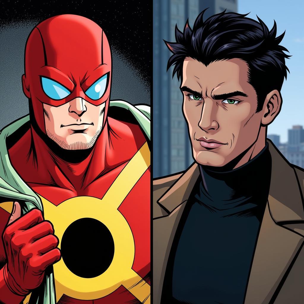 Invincible Season 1 Character Design Comparison
Exploring the Art of Violence in Invincible Season 1
The portrayal of violence in Invincible is a defining aspect of the show’s artistic identity. While graphic, the violence isn’t gratuitous. It serves a narrative purpose, highlighting the stakes and the consequences of the characters’ actions. The show doesn’t shy away from the brutal reality of superhuman conflicts, showcasing the physical and emotional toll they take on the characters. This unflinching depiction of violence adds a layer of realism and complexity to the superhero narrative, setting Invincible apart from its more sanitized counterparts.
“The key to portraying violence effectively is to understand its impact, not just physically but emotionally,” says renowned animation director, Anya Petrova. “Invincible succeeds in this by showcasing the human cost of these superhuman battles.”
The Art of Balancing Tone in Invincible
Invincible skillfully balances its darker, more violent moments with moments of levity and humor. This tonal balance prevents the show from becoming overly grim and allows it to explore a wider range of emotions. The humor often arises from the characters’ interactions and their reactions to the absurd situations they find themselves in. This juxtaposition of humor and violence creates a more nuanced and engaging viewing experience, reflecting the complexities of life itself.
“The blend of humor and darkness is what makes Invincible so compelling,” says comic book artist, Javier Rodriguez. “It reflects the inherent duality of human nature, our capacity for both great good and great destruction.”
Conclusion: A Masterclass in Superhero Storytelling
The art of Invincible season 1 lies in its ability to blend compelling characters, brutal action, and nuanced storytelling into a cohesive and unforgettable viewing experience. The show’s unique visual style, character designs, and animation techniques all contribute to its overall impact, setting a new standard for superhero animation. From its realistic portrayal of violence to its skillful balancing of tone, Invincible offers a fresh and thought-provoking take on the superhero genre.
FAQ
- Where can I watch Invincible season 1?
- Is Invincible season 2 coming out?
- Who is the strongest character in Invincible?
- Is Invincible based on a comic book?
- Who created Invincible?
- What is the age rating for Invincible?
- What other shows are similar to Invincible?
You can also explore these related articles on our website: “Top 10 Superhero Animated Series” and “The Influence of Comic Books on Modern Animation.”
Need help? Contact us at Phone Number: 02462573573, Email: danteum@gmail.com or visit our address: Savico Megamall, 7-9 Đ. Nguyễn Văn Linh, Gia Thụy, Long Biên, Hà Nội 10000, Việt Nam. We have a 24/7 customer support team.
