Spider-Man: Into the Spider-Verse Art: A New Era of Animation
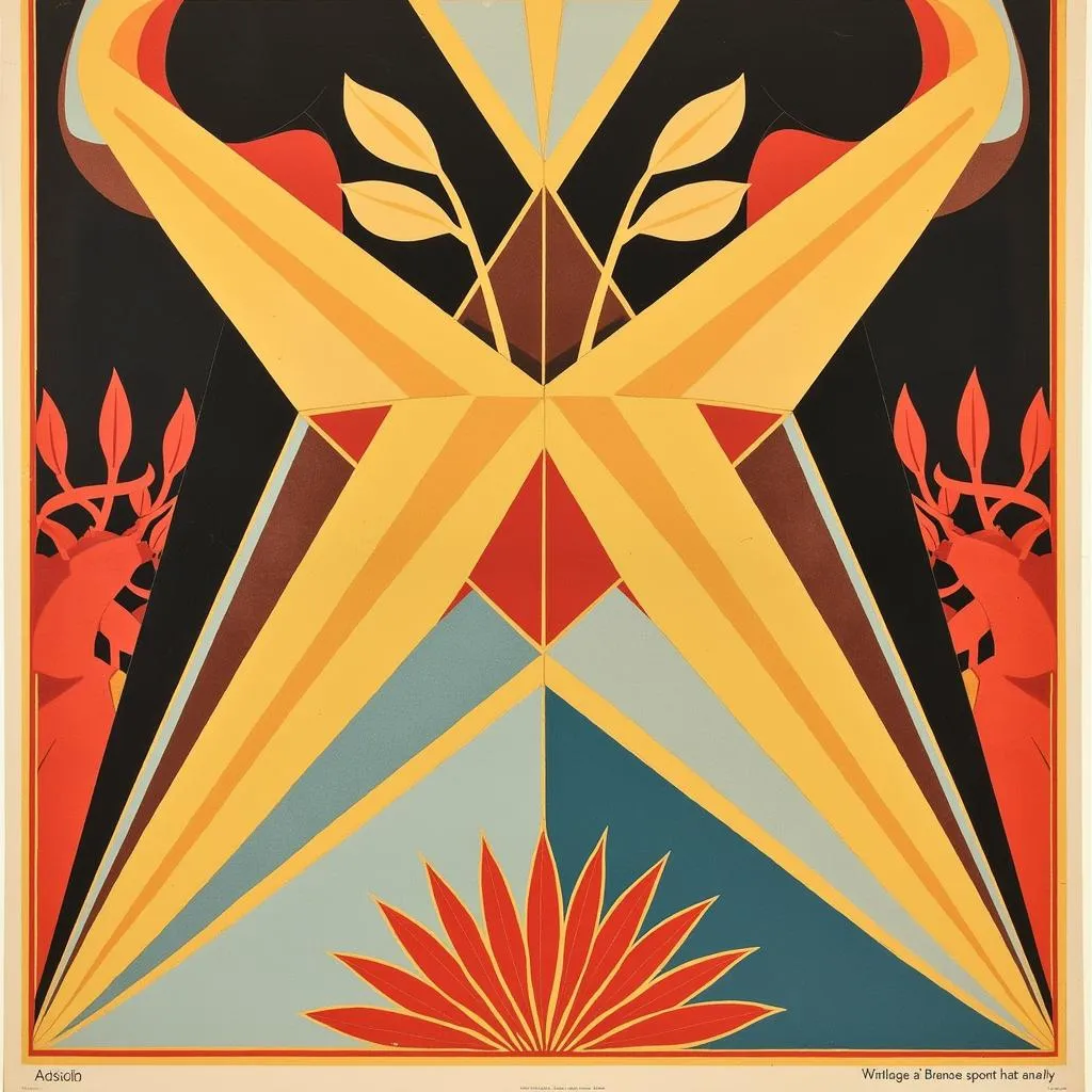
The groundbreaking animation style of “Spider-Man: Into the Spider-Verse” took the world by storm, showcasing a unique blend of CGI and traditional hand-drawn techniques. This innovative approach, heavily inspired by comic book aesthetics, breathed new life into the superhero genre, pushing the boundaries of visual storytelling and captivating audiences worldwide.
Deconstructing the Spider-Verse: A Fusion of Art Styles
What makes the “Spider-Man: Into the Spider-Verse art” so unique is its conscious departure from hyperrealistic CGI. Instead, the filmmakers embraced a more stylized approach, incorporating elements of comic book art, such as:
- Line work: Bold, graphic lines outline characters and objects, mimicking the ink strokes of comic books.
- Halftone dots: Ben-Day dots, a staple of vintage comic printing, are used to create shading and textures, adding a retro vibe.
- Dynamic motion lines: Exaggerated motion lines and speed trails emphasize the characters’ movements, injecting dynamism into every scene.
This fusion of classic comic book elements with modern CGI techniques creates a visually stunning experience that pays homage to the source material while forging a new artistic path.
A World Painted with Emotion: Color and Composition in Spider-Verse
The “Spider-Man: Into the Spider-Verse art” style extends beyond its linework and textures. The film utilizes a vibrant and dynamic color palette to evoke specific moods and emotions. Each Spider-Person’s dimension boasts its own distinct color scheme, further emphasizing their unique personalities and origins.
The composition of scenes also plays a crucial role in the film’s visual storytelling. Dutch angles, dramatic close-ups, and dynamic perspectives draw the viewer into the action, mimicking the panel layouts often found in comic books.
More Than Just Eye Candy: The Narrative Power of the Art Style
The “Spider-Man: Into the Spider-Verse art” style is not merely aesthetically pleasing; it serves a deeper narrative purpose. By embracing a stylized approach, the filmmakers were able to portray a diverse cast of characters with unique physical attributes and personalities.
The animation style allows each Spider-Person to move and express themselves in a way that feels authentic to their character. This results in a visually rich and emotionally resonant experience that resonates with audiences of all ages.
Conclusion: The Enduring Legacy of Spider-Verse Art
The “Spider-Man: Into the Spider-Verse art” style has left an indelible mark on the world of animation. It is a testament to the power of creative innovation and a celebration of the art form itself. By pushing the boundaries of what is possible in animation, “Spider-Man: Into the Spider-Verse” has inspired a new generation of artists and storytellers, proving that the possibilities are limitless when imagination takes center stage.
FAQ
Q1: What software was used to create the animation style in “Spider-Man: Into the Spider-Verse”?
A1: The filmmakers used a combination of software, including Autodesk Maya for 3D animation and proprietary tools developed specifically for the film.
Q2: How long did it take to animate “Spider-Man: Into the Spider-Verse”?
A2: The production process, including animation, took several years to complete, with a team of talented artists working tirelessly to bring the unique vision to life.
Q3: Will the sequel, “Spider-Man: Across the Spider-Verse,” feature the same art style?
A3: While the sequel will retain the core elements of the “Spider-Verse” art style, the filmmakers have hinted at further visual innovations and explorations.
Need Help? Contact Us!
For any questions or assistance, please contact our 24/7 customer support team:
Phone: 02462573573
Email: [email protected]
Address: Savico Megamall, 7-9 Đ. Nguyễn Văn Linh, Gia Thụy, Long Biên, Hà Nội 10000, Việt Nam.


