The Art of Terror: Crafting Horror Movie Poster Art
Horror Movie Poster Art is more than just advertising; it’s a glimpse into the nightmare, a promise of thrills and chills, and often, a work of art in its own right. From the iconic scream of Drew Barrymore in the original Scream poster to the unsettling imagery of The Exorcist, horror movie posters have captivated audiences and become cultural touchstones. This article delves into the art of creating effective and terrifying horror movie poster art, exploring the techniques, history, and psychology behind these visual masterpieces.
The power of a great horror movie poster lies in its ability to evoke a visceral reaction. It must capture the essence of the film’s terror while remaining visually compelling. It’s a balancing act between revealing just enough to intrigue and leaving the rest shrouded in mystery. Let’s explore the elements that contribute to a truly effective horror movie poster.
The Psychology of Fear: Understanding the Audience
Horror thrives on primal fears. Effective horror movie poster art taps into these deep-seated anxieties, using visual language to trigger feelings of unease, dread, and anticipation. Consider the use of shadows, distorted figures, and unsettling color palettes to create a sense of foreboding. The goal isn’t just to scare, but to fascinate, drawing the viewer in with a promise of the unknown.
What makes a face truly terrifying? Is it the exaggerated features, the vacant eyes, or the subtle suggestion of something inhuman lurking beneath the surface? Horror poster artists play with these elements, manipulating our perceptions and exploiting our vulnerabilities.
After this initial wave of intrigue, the poster must convey the tone and theme of the film. A slasher flick will employ different visual cues than a psychological thriller. Think about the difference between the stark, graphic imagery of Friday the 13th cover art and the more subtle, unsettling atmosphere of a poster for The Shining.
Creating a Visual Narrative: Composition and Design
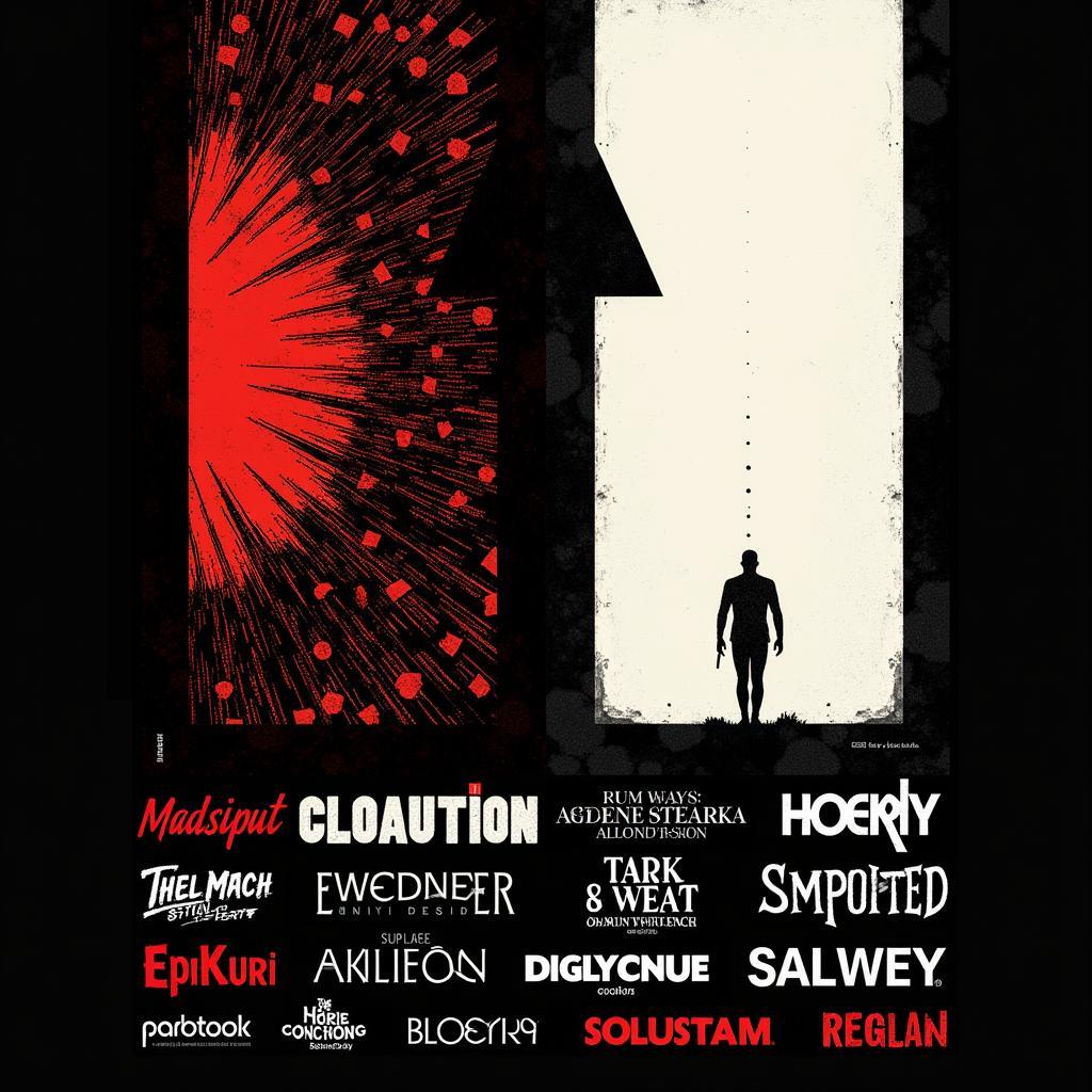
The composition of a horror movie poster is crucial. The placement of elements, the use of negative space, and the overall flow of the image all contribute to the narrative being conveyed. A cluttered poster can be confusing, while a minimalist design can be incredibly impactful. Think of the stark simplicity of Jaws, with the lone swimmer silhouetted against the approaching shark.
Color plays a vital role in setting the mood. Deep reds, blacks, and greens are often used to create a sense of dread, while stark contrasts can heighten the sense of unease. The color palette should complement the overall theme of the film, enhancing the visual narrative.
Typography is another key element. The font choice, size, and placement can all contribute to the overall effect. A dripping, blood-red font can evoke a sense of gore, while a distorted, jagged font can suggest psychological instability. The title treatment should be both visually striking and reflective of the film’s genre. Check out the classic Halloween movie poster art for inspiration on how effective typography can be.
 Horror Movie Poster Composition and Design
Evolution of Horror Movie Poster Art: From Classic to Contemporary
Horror movie posters have evolved significantly over the decades, reflecting changes in societal fears and artistic trends. Early horror posters often featured lurid illustrations and sensationalized taglines. Think of the classic monster movies of the 1930s, with their bold graphics and promises of terror.
The 1970s and 80s saw a rise in slasher films, with posters often featuring graphic depictions of violence and iconic villains. The Friday the 13th franchise is a prime example of this trend. More recently, horror posters have embraced a more subtle and psychological approach, relying on atmosphere and suggestion rather than outright gore. You can even find inspiration from unexpected sources, like mexican pulp art, with its vibrant colors and dramatic imagery.
The Digital Age: Creating Horror Art in the 21st Century
Today, digital tools have revolutionized the creation of horror movie poster art. Artists can now create stunningly realistic and complex images, pushing the boundaries of what’s possible. However, the core principles of effective horror poster design remain the same: understanding the psychology of fear, creating a compelling visual narrative, and reflecting the tone and theme of the film. If you are a fan of specific horror icons, you can even find themed artwork, like Michael Myers canvas art, to adorn your walls. Or, if you prefer a more general spooky aesthetic, spooky art prints offer a wide range of options.
In conclusion, horror movie poster art is a powerful and evocative form of visual storytelling. It’s a delicate balance of art and marketing, designed to both terrify and entice. By understanding the principles of effective horror poster design, artists can create truly memorable and impactful images that will stay with audiences long after the credits roll. Are you ready to create your own chilling masterpiece?
FAQ
-
What are some common themes in horror movie poster art?
Common themes include shadows, distorted figures, unsettling color palettes, and close-ups of terrifying faces. -
How has digital technology impacted horror movie poster art?
Digital tools have allowed artists to create more complex and realistic images, pushing the boundaries of what’s possible. -
What is the role of typography in horror movie posters?
Typography can contribute significantly to the overall mood and tone of the poster, with different fonts evoking different emotions. -
What are some key considerations when designing a horror movie poster?
Key considerations include understanding the target audience, creating a compelling visual narrative, and reflecting the tone and theme of the film. -
Where can I find inspiration for horror movie poster art?
Inspiration can be found from classic horror films, art history, and even unexpected sources like Mexican pulp art. You might also be interested in exploring specific character art, such as Michael Myers canvas art. -
What are some examples of effective horror movie posters?
Examples include the posters for Jaws, The Exorcist, Scream, and The Shining.
For support, please contact Phone Number: 02462573573, Email: danteum@gmail.com Or visit: Savico Megamall, 7-9 Đ. Nguyễn Văn Linh, Gia Thụy, Long Biên, Hà Nội 10000, Việt Nam. We have a 24/7 customer support team.


