Decoding Bad Composition in Art: A Guide to Avoiding Common Pitfalls
Bad Composition In Art can make even the most technically brilliant piece fall flat. It’s the awkward silence in a conversation, the off-key note in a melody. Understanding how to avoid bad composition is key to creating artwork that truly resonates with viewers. Let’s delve into the common mistakes and explore how to create visually compelling compositions.
Understanding the Importance of Composition
Composition, in its simplest form, is the arrangement of elements within a work of art. It directs the viewer’s eye, creates balance and harmony, and ultimately tells a story. A well-composed piece draws the viewer in and keeps them engaged, while bad composition can leave them confused or disengaged. Have you ever looked at a painting and felt something was “off,” even if you couldn’t quite put your finger on it? That’s likely a composition issue. Check out these flower photo art examples for inspiration on composition.
Common Composition Mistakes to Avoid
- Overcrowding: Cramming too much into the frame creates visual clutter and makes it difficult for the viewer to find a focal point. Less is often more.
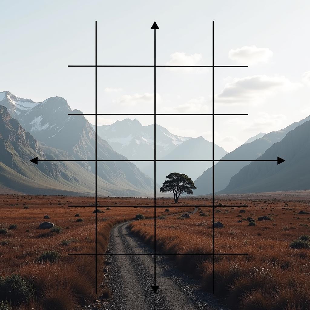
- Ignoring the Rule of Thirds: This guideline suggests placing key elements off-center for a more dynamic and engaging composition.
- Lack of Balance: A lopsided composition can feel unstable and unsettling. Balance can be achieved through symmetry, asymmetry, or radial arrangements.
- Ignoring Negative Space: The empty space around your subject is just as important as the subject itself. It gives the eye a place to rest and helps to highlight the main elements.
- Inconsistent Perspective: Errors in perspective can make a scene look distorted and unrealistic.
- Lack of Contrast: A lack of contrast between elements can make a piece feel flat and uninteresting.
How Do I Fix Bad Composition in My Art?
Recognizing bad composition is the first step towards improvement. Here are some actionable steps you can take:
- Analyze Your Work: Take a step back and look at your piece with fresh eyes. What is the first thing you notice? Where does your eye travel? Are there any areas that feel unbalanced or cluttered?
- Simplify: If your composition feels overcrowded, remove unnecessary elements. Focus on what’s essential to your message. You can find some minimal and effective art ladder designs to study this principle further.
- Apply the Rule of Thirds: Imagine a grid dividing your canvas into nine equal sections. Place your focal points along these lines or at their intersections.
- Experiment with Balance: Try different arrangements of elements to find a balance that feels right. Consider the visual weight of each element and how it interacts with the others.
- Embrace Negative Space: Don’t be afraid to leave some areas empty. Negative space can add a sense of calm and sophistication to your composition. This is particularly effective in art flower photography.
- Study Perspective: If you’re working with realistic scenes, make sure your perspective is accurate. Practice drawing or painting objects from different angles to improve your understanding of perspective.
 Example of Good Composition: Using the Rule of Thirds
Expert Insights on Composition
Renowned artist and educator, Anya Sharma, emphasizes the importance of understanding the viewer’s journey: “Composition is about guiding the viewer’s eye through your artwork, creating a narrative experience. A successful composition is like a well-written story, with a clear beginning, middle, and end.”
Another expert, David Rossi, adds, “Don’t be afraid to break the rules once you understand them. Sometimes, the most compelling compositions arise from unexpected choices.”
Conclusion
Bad composition in art can be overcome with careful observation and practice. By understanding the principles of composition and applying them thoughtfully, you can transform your artwork from adequate to captivating. Start by identifying common mistakes, experimenting with different approaches, and remember, like anything in art, mastering composition takes time and dedication. Don’t be discouraged! Keep exploring, and your compositions will undoubtedly improve. For colorful inspiration, explore these color wheel art ideas. Perhaps you might even find inspiration in unconventional places, like these alfa romeo art pieces.
FAQ
- What is the most common composition mistake? Overcrowding the frame is a very frequent issue.
- How can I improve my composition skills? Practice and studying the work of master artists are key.
- What is the rule of thirds? It’s a guideline that suggests placing key elements off-center.
- Why is negative space important? It provides visual balance and emphasizes the subject.
- How does bad composition affect a piece of art? It can make the piece feel unbalanced, cluttered, and ultimately less engaging.
- What are some good resources for learning about composition? Art books, online tutorials, and museum visits are all excellent resources.
- Is it okay to break the rules of composition? Yes, once you understand them, breaking them strategically can lead to unique and compelling results.
For any support, contact us 24/7 at Phone: 02462573573, Email: danteum@gmail.com or visit us at Savico Megamall, 7-9 Đ. Nguyễn Văn Linh, Gia Thụy, Long Biên, Hà Nội 10000, Việt Nam.


