In Flames Album Art: A Visual History of Melodic Death Metal
From their early days of raw aggression to their later forays into melodic experimentation, In Flames has consistently produced music that pushes the boundaries of melodic death metal. But just as important as their sonic evolution has been their striking visual identity, showcased through their iconic album covers. In Flames Album Art is more than just decoration; it’s a window into the band’s evolving sound, themes, and the minds of the artists behind the music.
The Jester Head Era: A Symbol is Born
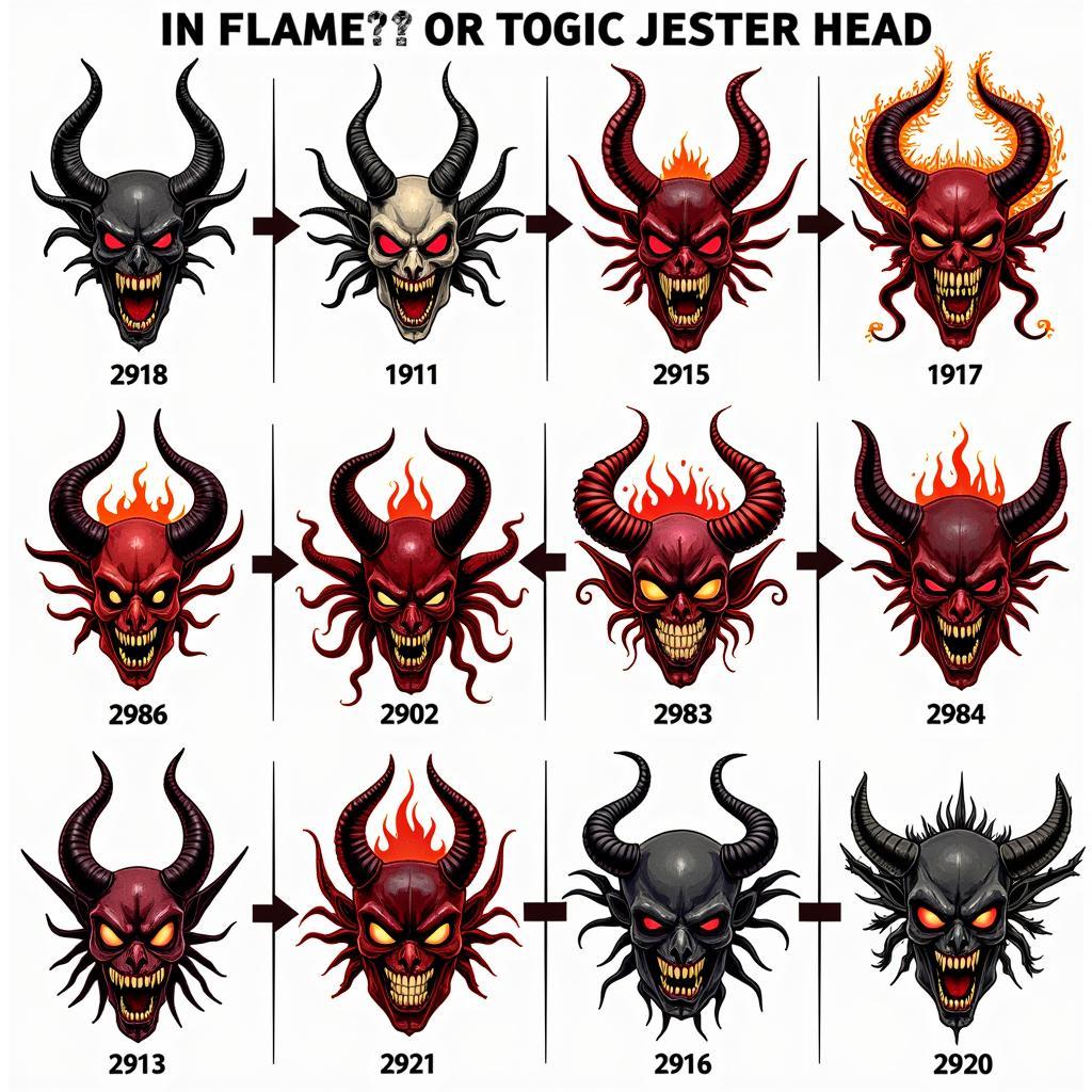
 Evolution of In Flames' Jester Head
The “Jester Head,” In Flames’ signature logo, first appeared on their 1996 album, “The Jester Race.” Designed by Niklas Sundin, the band’s guitarist at the time, the Jester Head quickly became synonymous with the melodic death metal scene. Its grotesque yet whimsical design, often depicted with flames and intricate patterns, perfectly captured the band’s sound: a blend of brutal riffs, soaring melodies, and melancholic undertones. The Jester Head has graced the covers of almost every In Flames album since its debut, evolving slightly with each iteration to reflect the band’s changing musical direction.
From Fire and Ice to Cosmic Landscapes: Deciphering the Imagery
In Flames’ album art often utilizes vivid, symbolic imagery that complements the lyrical themes explored in their music. Fire, a recurring motif, represents both destruction and passion, reflecting the band’s intense energy and exploration of human emotion. “Colony,” for instance, features a burning figure, symbolizing the struggle against societal constraints. “Clayman” takes a different approach, using water and earthy tones to evoke feelings of isolation and introspection, mirroring the album’s focus on personal struggles.
Beyond the Jester: Collaborating with Visionary Artists
While the Jester Head remains a constant, In Flames has collaborated with various artists over the years, each bringing their unique style to the band’s visual identity. “Soundtrack to Your Escape” features the surreal artwork of Derek Hess, known for his expressive linework and depictions of emotional turmoil, while “A Sense of Purpose” saw the band teaming up with Alex Pardee, whose work often blends macabre elements with vibrant colors, creating a surreal and unsettling atmosphere.
“The artwork is like a visual interpretation of the music,” says Anders Fridén, In Flames’ vocalist. “It’s about creating a cohesive experience, where the visuals enhance the emotions and stories we’re trying to convey through our music.”
The Future of In Flames’ Visual Identity: Burning Brighter Than Ever
In Flames continues to evolve, both musically and visually. Their recent album covers have seen a shift towards more abstract and minimalist designs, while still retaining the band’s signature intensity. The use of negative space, bold typography, and subtle color gradients creates a sense of mystery and intrigue, inviting listeners to delve deeper into the music.
The evolution of In Flames’ album art reflects the band’s own artistic journey, always pushing creative boundaries and exploring new ways to connect with their audience. From the iconic Jester Head to the evocative imagery and collaborations with renowned artists, In Flames’ visual identity is as powerful and enduring as their music, cementing their status as true pioneers of melodic death metal.

